Mobile product design · Savanta · YourVue
A survey app that stops wasting people's time
Reward apps pay you for your time, then waste it screening you out of survey after survey. Savanta's first app fixed that, showing people only the surveys they actually qualify for. Built on research, shipped on iOS and Android.
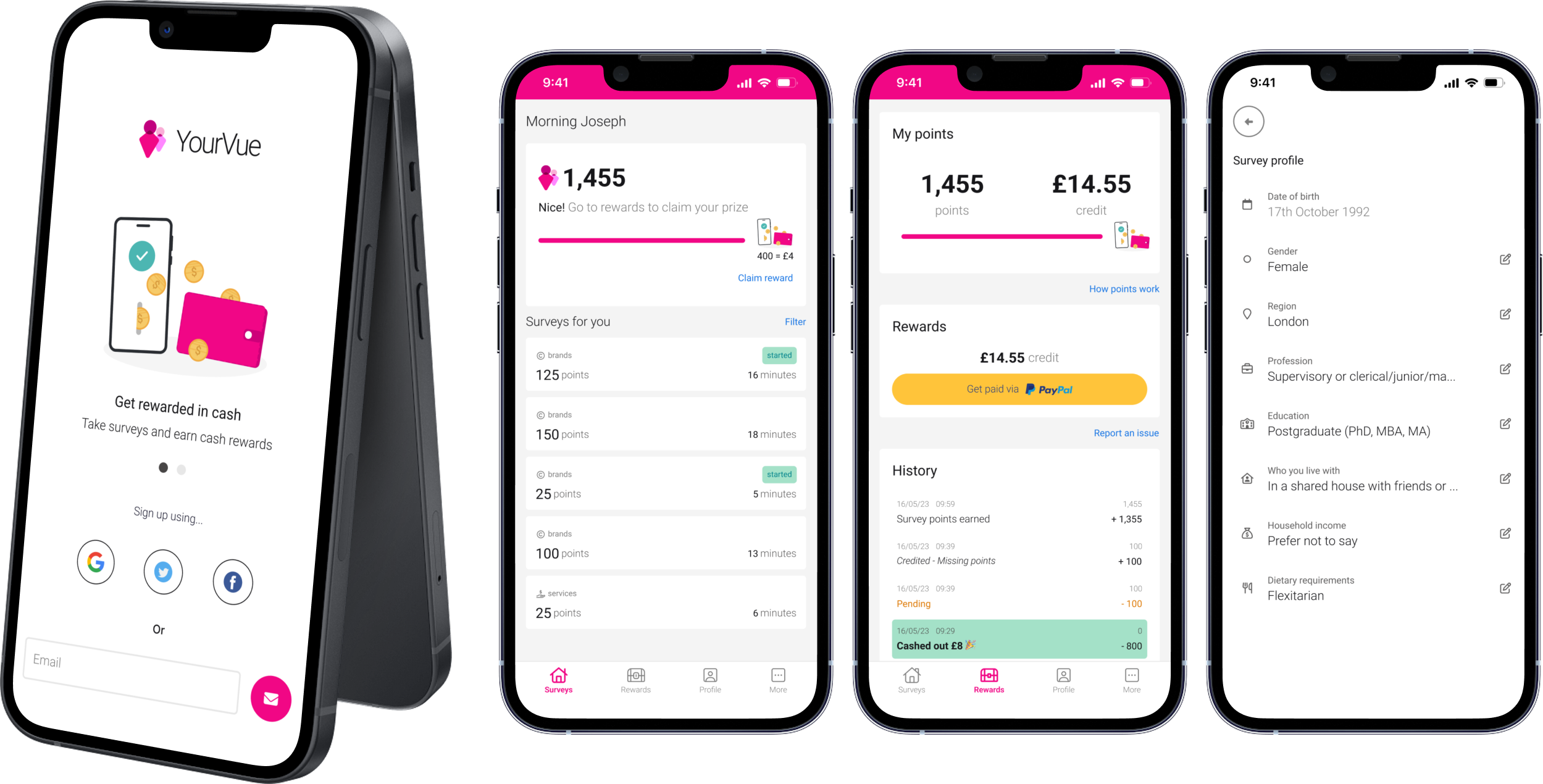
Overview
Everyone said copy the market leader. Research found the one thing no rival could match, and built the app around it.
Savanta's first app, entering a crowded reward survey market. The instinct from the team was to copy the leader and move fast.
Reward apps waste your time. You trade minutes for points, get screened out of one survey after another, and earn nothing.
Taken in the first six months. Personalisation meant people only saw ones they qualified for, and the app rated above 4 stars.
Move an existing panel into our first app.
Savanta leaned heavily on external panels to find people for surveys, and those costs were climbing. It also ran its own web panel, the OpinionPanel. Rather than have the two compete, the plan was to close the OpinionPanel and move its users into a new app, our first B2C product, then grow the panel from there.
The direction from our main stakeholder was blunt.
"We really like Qmee, let's just copy them."
Internal stakeholder
Qmee is a survey app handling up to 100,000 surveys a day. The instinct was to copy it and move fast.
Copying gets you to second
It was the quick option, and the safe looking one. But arriving late with a copy of what someone already does well gives people no reason to switch.
So rather than push back on the plan, I built on it. A short piece of research up front would let us keep what stakeholders liked about Qmee, the parts users genuinely value, and get ahead where the market let people down. Same speed to a credible product, better odds of users moving across. They backed it, and the brief shifted from copying a competitor to learning from the whole market and beating it in the gaps.
Copying the leader only ever gets you to second.
The pivot in the briefFinding the gaps the leaders left open.
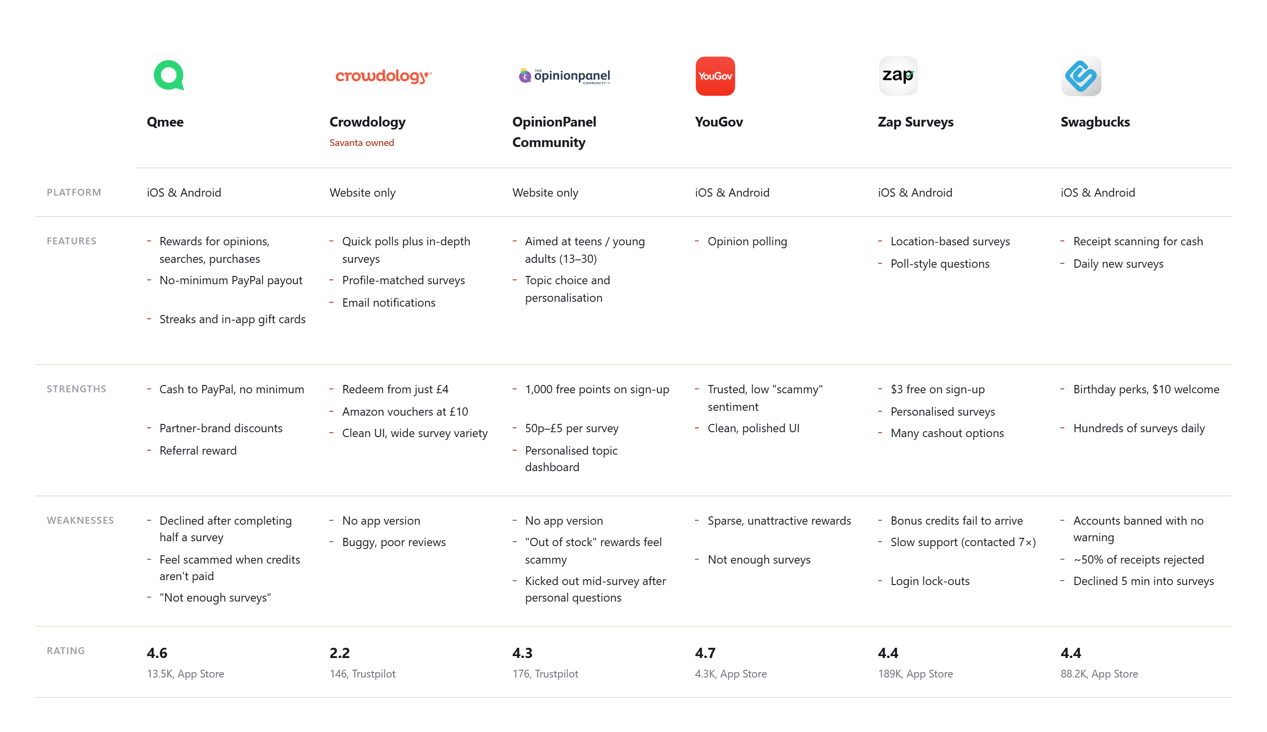
We reviewed three direct competitors and three market leaders, looking at what each did well and where it lost people. Then we ran two rounds of testing with five users from the OpinionPanel, adapting the designs between rounds. Three findings shaped the product.
We own both the panel and the survey engine, so we could store someone's details once and only show them surveys they qualify for. Most rivals cannot do this.
People trade their time for points. If something breaks and support is slow, the app feels untrustworthy and they leave.
A constraint had us launching with PayPal only. Testing showed a big group wanted alternatives, Amazon, Costa and others.
Testing also answered the bigger question. We were not relying on a gimmick. The core was strong enough to compete with the leaders on its own terms.
What we built that the others hadn't.
The differentiators came straight from the research, each one aimed at a gap the competition left open.
Personalisation, from our own data
Save your details once, see only the surveys you qualify for. No wasted time, no being screened out halfway through. The backbone, and the thing rivals structurally could not match.
Gamification
Levels, badges and progress, drawn from Duolingo, Fitbit and the Octalysis framework. A reason to return beyond the cash.
A referral scheme
Points for inviting people who join and complete surveys, so the panel could grow itself rather than lean on paid acquisition.
Easier cash out
Lower payout thresholds and more ways to take the money out, answering the biggest frustration users had with every rival.
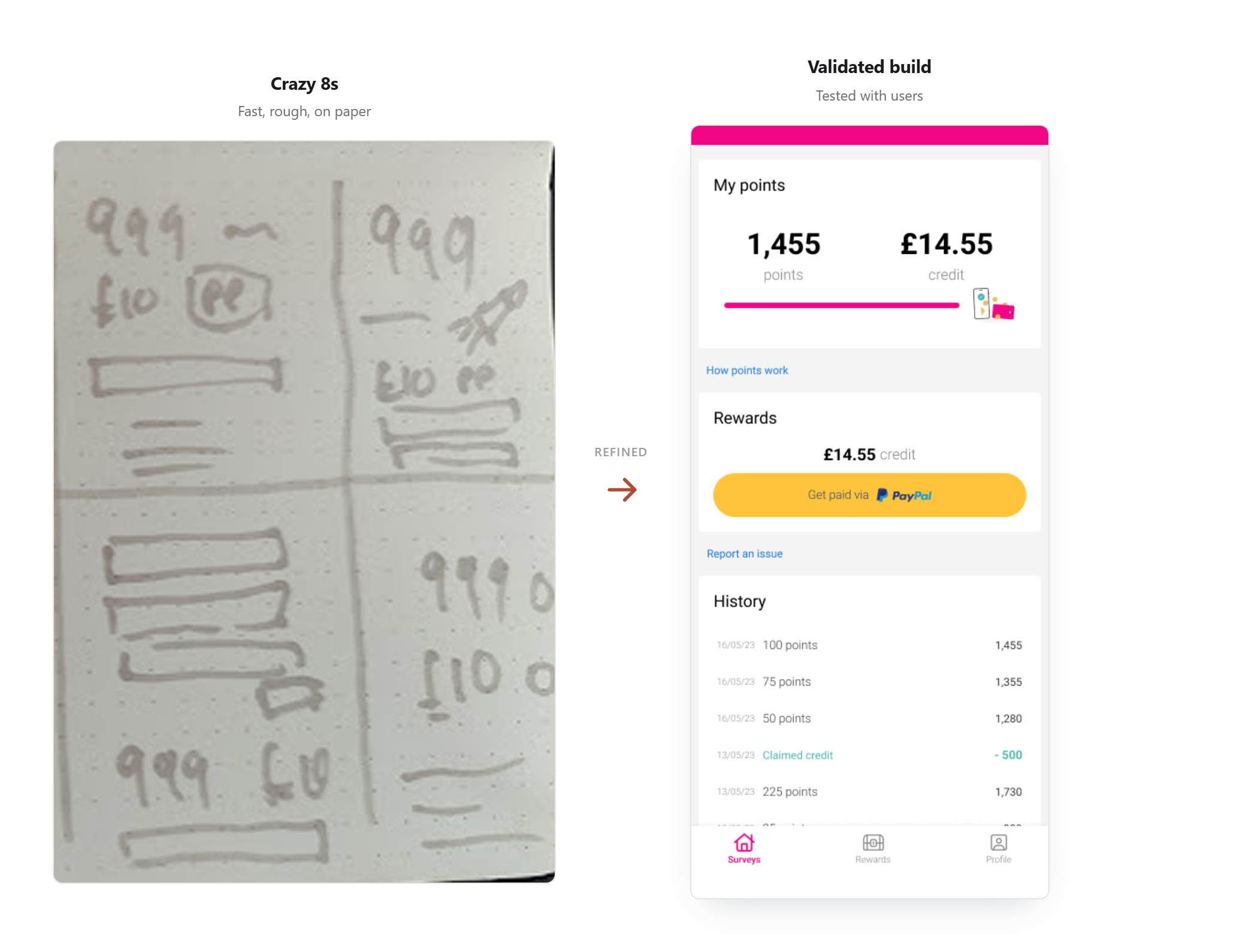
None of this went straight to high fidelity. Where a flow needed options, I ran crazy 8s to get the weak ideas out fast and find the one worth building. Because the research was solid, the winners held up when we tested them.
Personalisation, mapped end to end
The advantage only works if the flow around it does, and this is the heart of it. A user gives their details once, then only ever sees surveys they qualify for. I built the consent as a real choice, not a data grab. Decline it and you still get the full app, just without the matching.
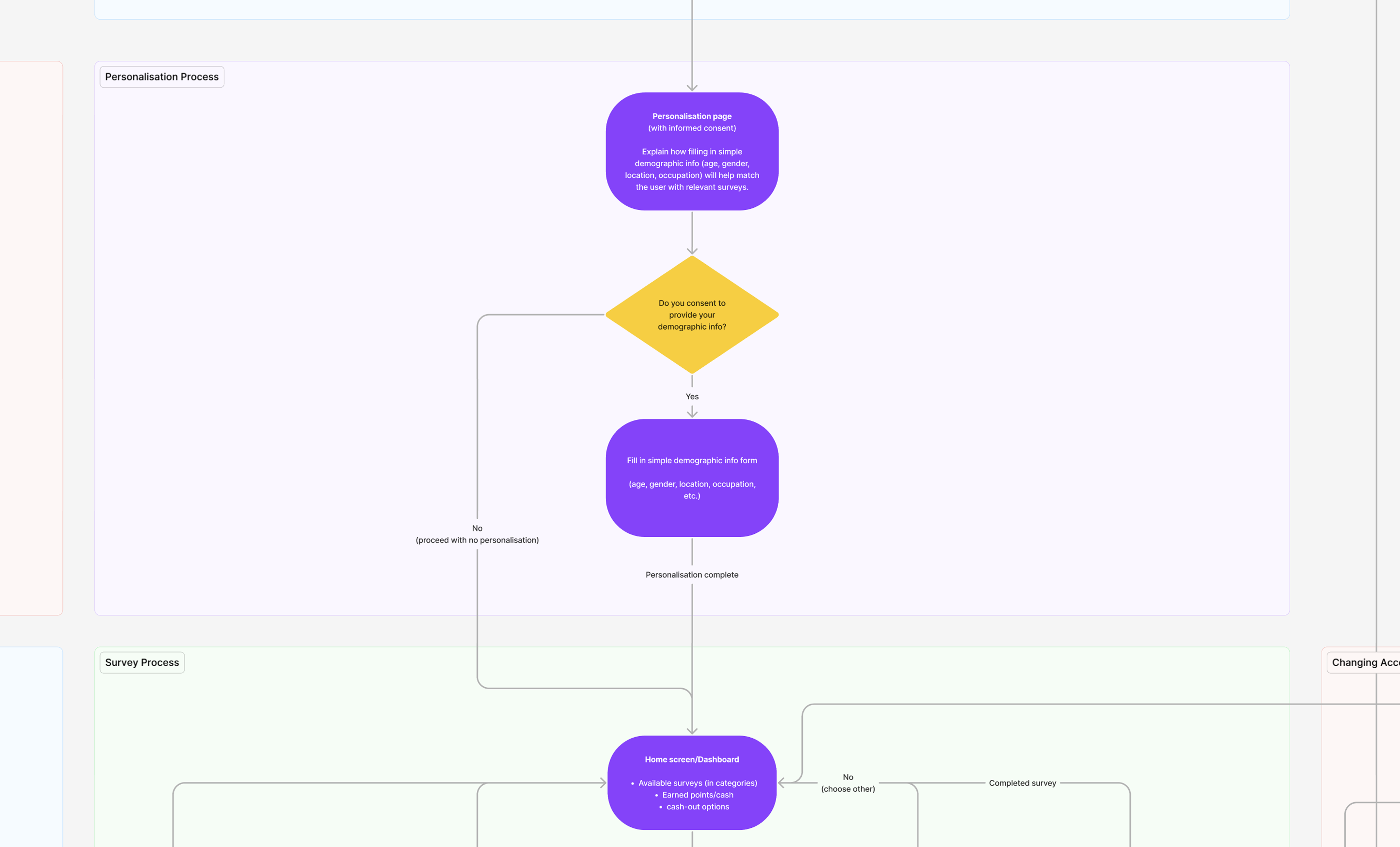 See the full flow
A lite design system, and an argument for fidelity
Savanta's design system did not support mobile apps, so I could not lean on it. Rather than treat that as a blocker, I built a lightweight system from scratch. Enough to hold best practice and consistency, but scoped tightly so it would not cost us the release date.
I also made the case to development that fidelity mattered more than usual here. An app is not a web tool. A first impression of a clunky interface or a bug is enough for someone to delete it and never come back.
Bringing a junior through her first full cycle.
I brought a junior designer through the whole project, her first time running a full cycle end to end. The pattern throughout was simple. See it done once, then own it, and get sharper each time.
Model, then hand over
I would show a skill, but always asked how she would approach it first. If her idea was sound, we ran with it.
Observe, then do
I ran the first user interview while she watched, then she ran the next with feedback straight after.
Coach with questions, not answers
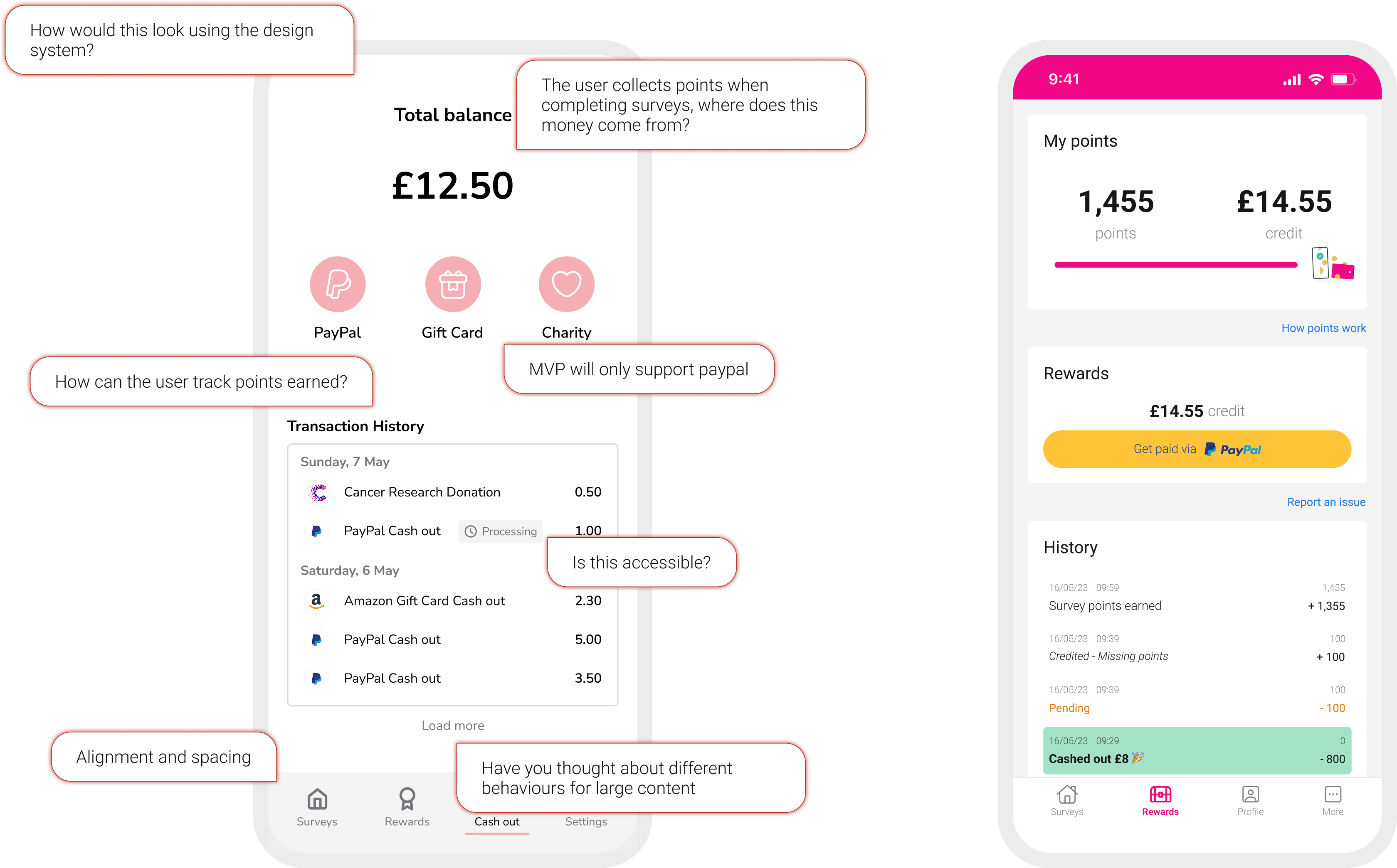
Where does the reward money come from? How does a user track their points? Is this accessible? The questions did the teaching.
Push past the comfort zone
I had her present her own designs to the tech team and defend the why, not just the what.
Presenting was daunting for her early on. By the end she was walking developers through her thinking without me in the room, and took those skills into her next project with far less input from me. I picked up plenty from her too.
A clean migration, and strong early adoption.
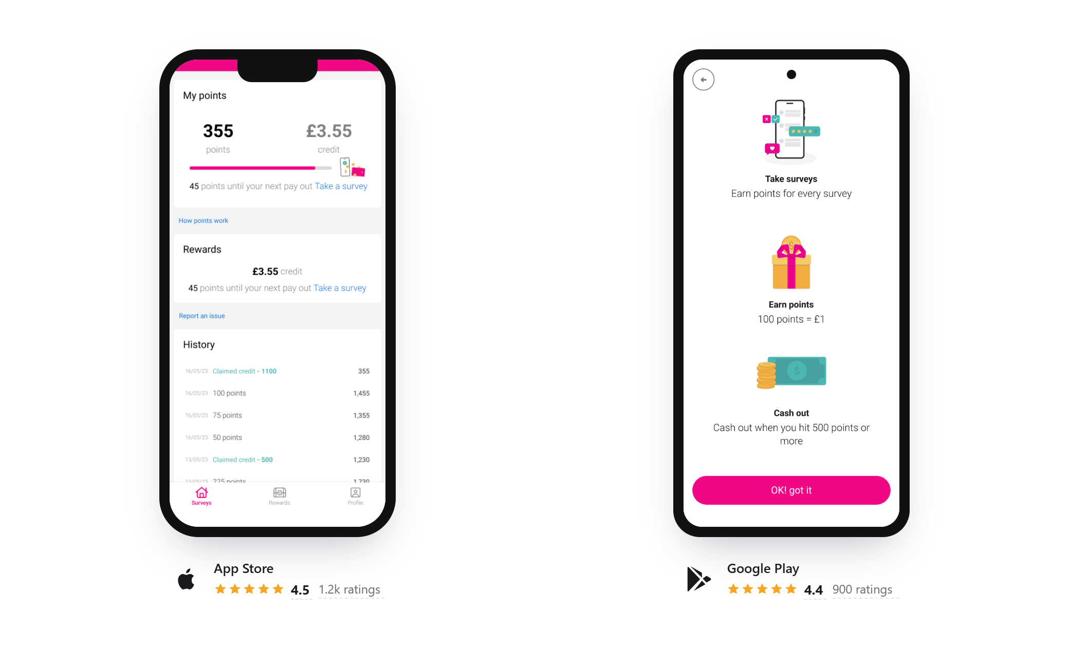
We shipped on iOS and Android, built in Flutter. The first job was moving the OpinionPanel users across, and it went well. Around 10,000 of the 14,000 invited made the move, a strong transfer rate and a solid base to build on.
Adoption backed up the research. Users took more than 150,000 surveys in the first six months, and the app held above 4 stars across both stores. The personalisation advantage showed, and the core held up under real use.
What I took away
Research matters even when the pattern is solved
A reward survey app is familiar ground. Research is what let us copy the proven parts and get ahead in the gaps, rather than ship a weaker copy.
Build on an advantage others can't copy
Personalisation worked because we owned both the panel and the survey engine. The win wasn't the feature, it was finding the one thing rivals had no way to match, and building around it.
You don't need a full system to hold quality
The right components, scoped to the job, keep consistency and pace without building more than we needed.
Gamification is easy to add, hard to get right
Ours came from a handful of well known examples. I'd now look far wider, across apps with nothing to do with surveys, to separate the mechanics that genuinely build a habit from the ones that feel like a gimmick and wear off fast.