Product design · Savanta · BrandVue
Turning a nine month onboarding into a tool anyone can pick up
BrandVue holds some of Savanta's best brand data. It was so complex that most clients leaned on an account manager instead of using it. I led the redesign so anyone could reach the insight on their own.
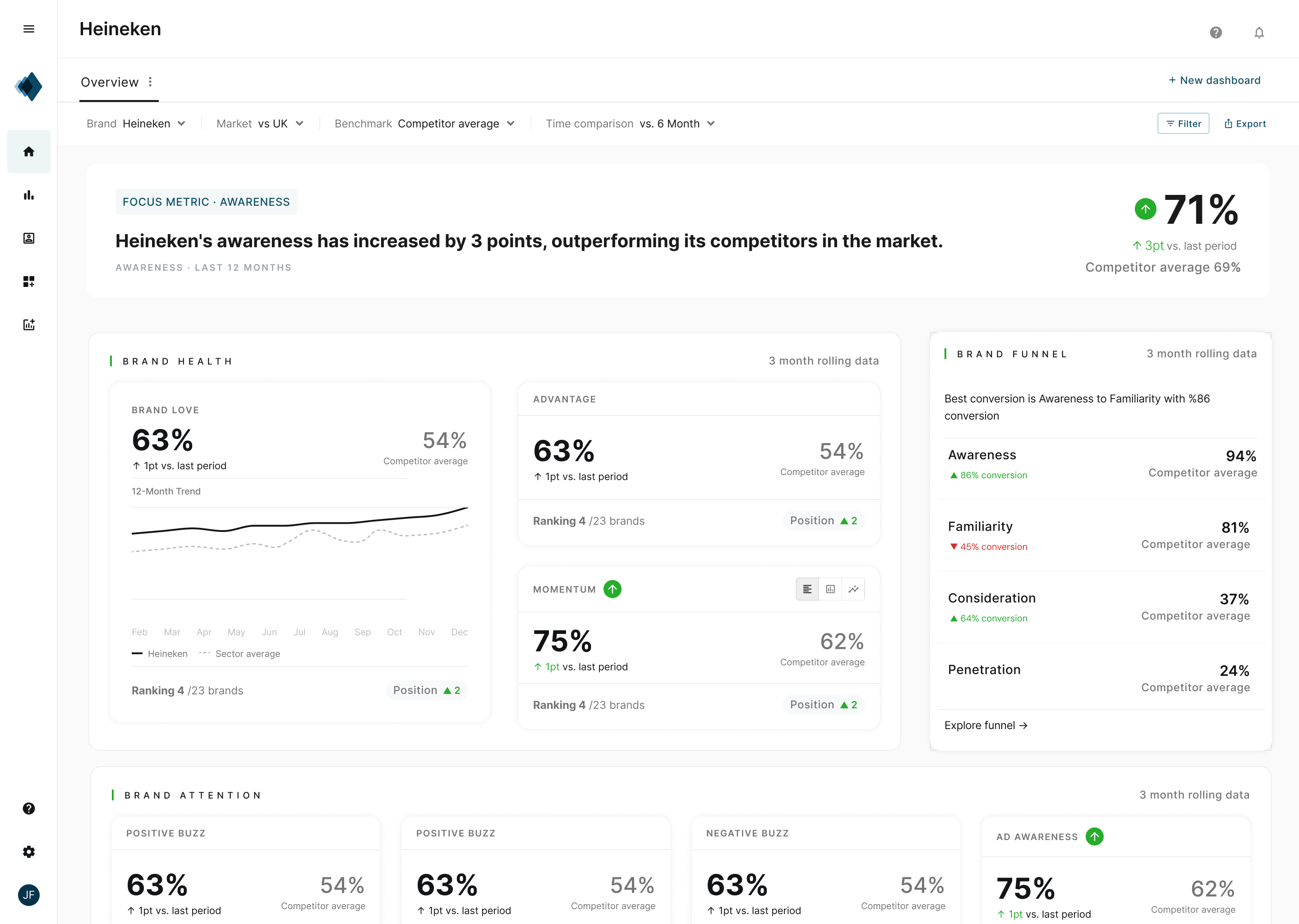
Overview
Some of Savanta's best data, in a product almost nobody could use on their own. I led the redesign to hand it back to the people using it.
BrandVue is Savanta's core brand tracker. Rich data, four kinds of user, and one way in that suited almost none of them.
Built around the data, not the people. Onboarding ran to nine months, and most clients relied on their account manager to get anything out of it.
The pattern that made it learnable also onboards a new client in minutes. Now anyone can reach the insight on their own.
Built around our data, not the people using it.
The problem was never the data. BrandVue holds some of the best brand data Savanta produces. It was the route to it that failed people.
It was built to mirror how we work inside Savanta, all the depth on show from the first screen. That suited the analysts who live in the detail, and even they took months to settle in. Everyone else was stranded, asking their account manager what to look at instead of exploring the product they had bought.
It was also held together by hand. Reports built manually, insight assembled for clients rather than found by them. For a product this central to the business, that added up to one uncomfortable set of numbers.
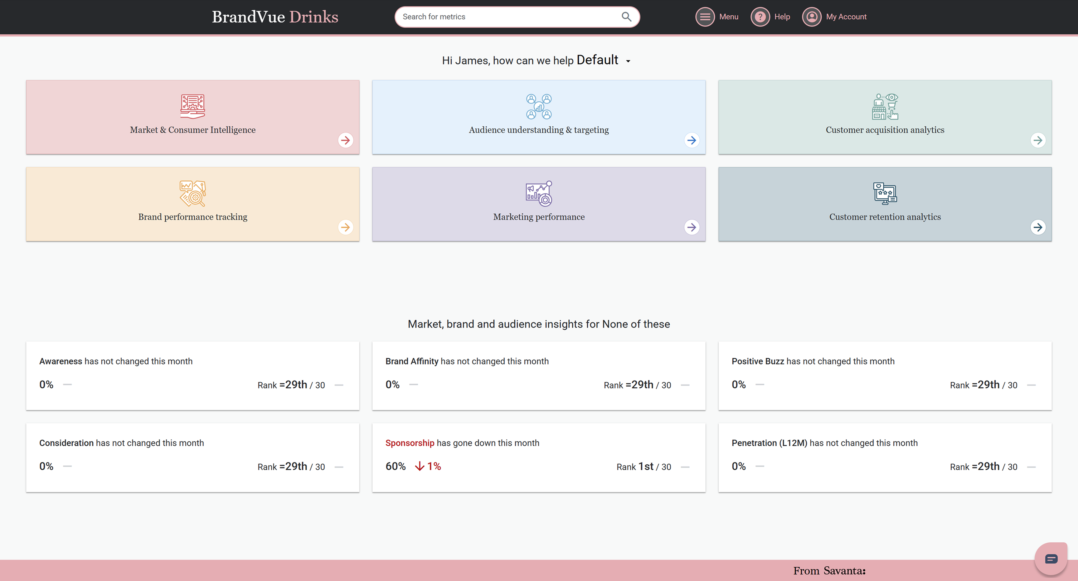
It assumed knowledge it never taught
The biggest finding was an assumption nobody knew they had made. It showed up in three ways.
You had to arrive already knowing the funnel, the terminology, what a healthy score even looks like. Miss that hidden bar and you were lost from the first screen.
The business built for the analyst who lived in the data. Research found four types, and he was the smallest. The majority just wanted a clear answer, quickly.
The navigation was an exhaustive list of everything the data could show. It mapped the database, not a single job anyone came to do.
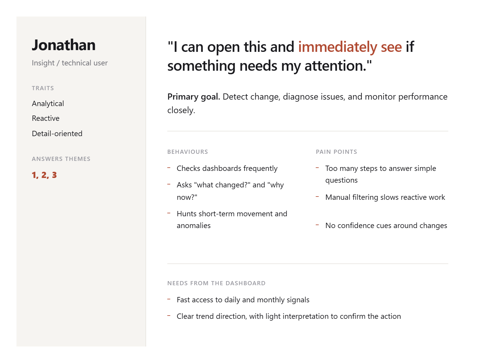
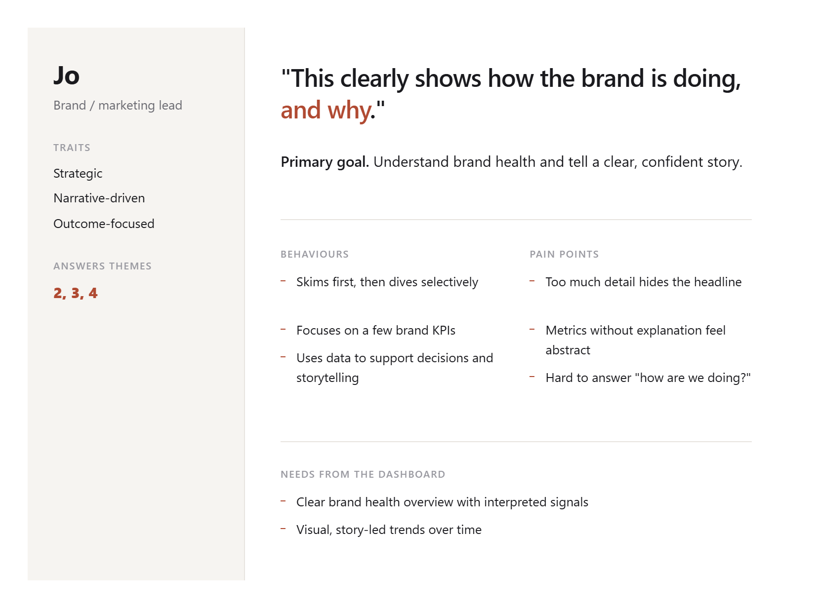
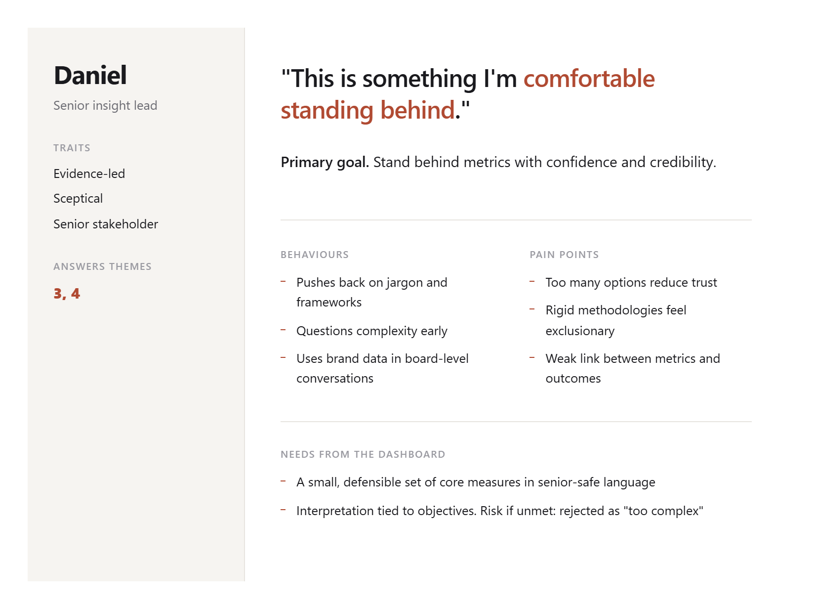
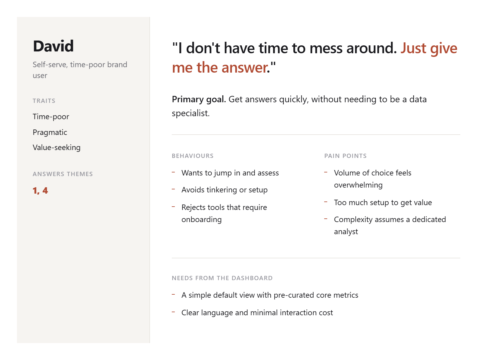
Complexity first was backwards.
The product led with complexity and left users to make sense of it. We turned it around. Lead with clarity, and keep the depth there for the people who go looking.
The rule was simple. Someone with no data background should be able to pick this up and get value from it. Not by stripping the product back, but by changing the order it reveals itself, and building in the teaching the old one assumed you did not need.
Four themes that set the direction
The research settled into four patterns, each pointing at something to build.
Fast answers before depth
Even power users wanted value straight away. Insight had to come before configuration.
One dashboard, two modes
People switch between quick daily checks and deep strategic work. The product had to hold both.
Interpretation builds confidence
Numbers alone did not feel safe to act on. Every key metric needed a clear "what this tells you".
Simplicity increases trust
Too much choice damaged credibility. Fewer visible options felt more trustworthy, not less capable.
Clarification, not scale back.
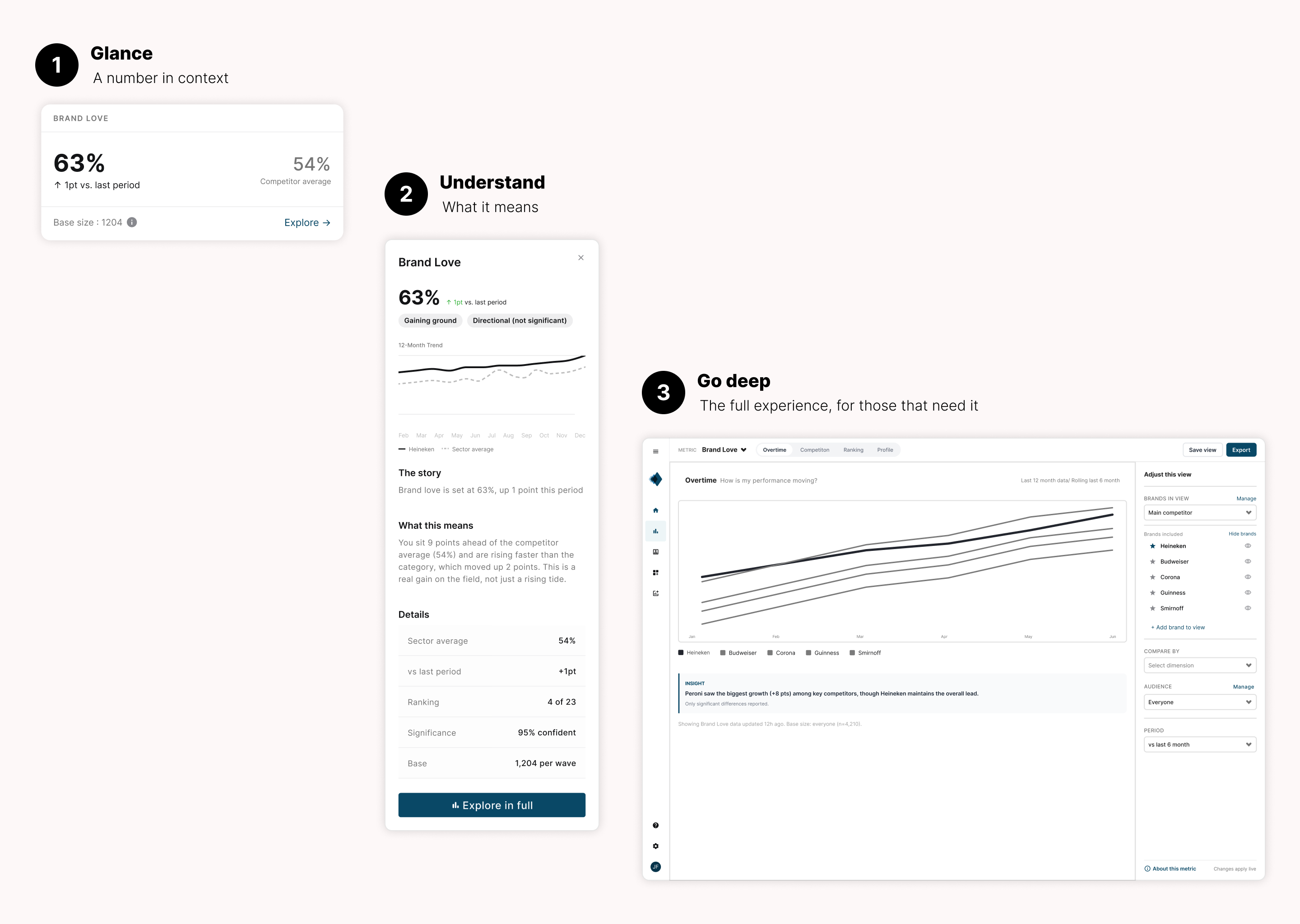
The principle behind the redesignThree levels, from headline to deep dive.
One model, three layers. Each answers a different depth of question, so a user only goes as deep as they need.
A number, a reference for good or bad, a hint of the trend. Concise by design.
Click a card and a panel explains it in plain language. The teaching that used to live in an account manager's head.
Filter, compare, build on the metric. The complexity is still there. It just is not the first thing you meet.
One pattern, a second problem solved
That deepest level, the builder, turned out to fix a second problem. A big part of the 5% was onboarding. Winning a new client meant months of bespoke development to stand up their portal, even though we already held their data.
The same builder could do that job. Same pattern, same backend, pointed at a different problem. Someone writes one prompt, "Our client is Guinness, they care about standing out in a crowded market and winning younger drinkers", and it proposes a starting dashboard and a plain language tagline drawn from the data. The person always has the final say and can change any of it in a click.
Months of setup became minutes. It also reframes what a client's homepage is for. The client decides what matters most, and everyone at their company opens the product to that same shared view.
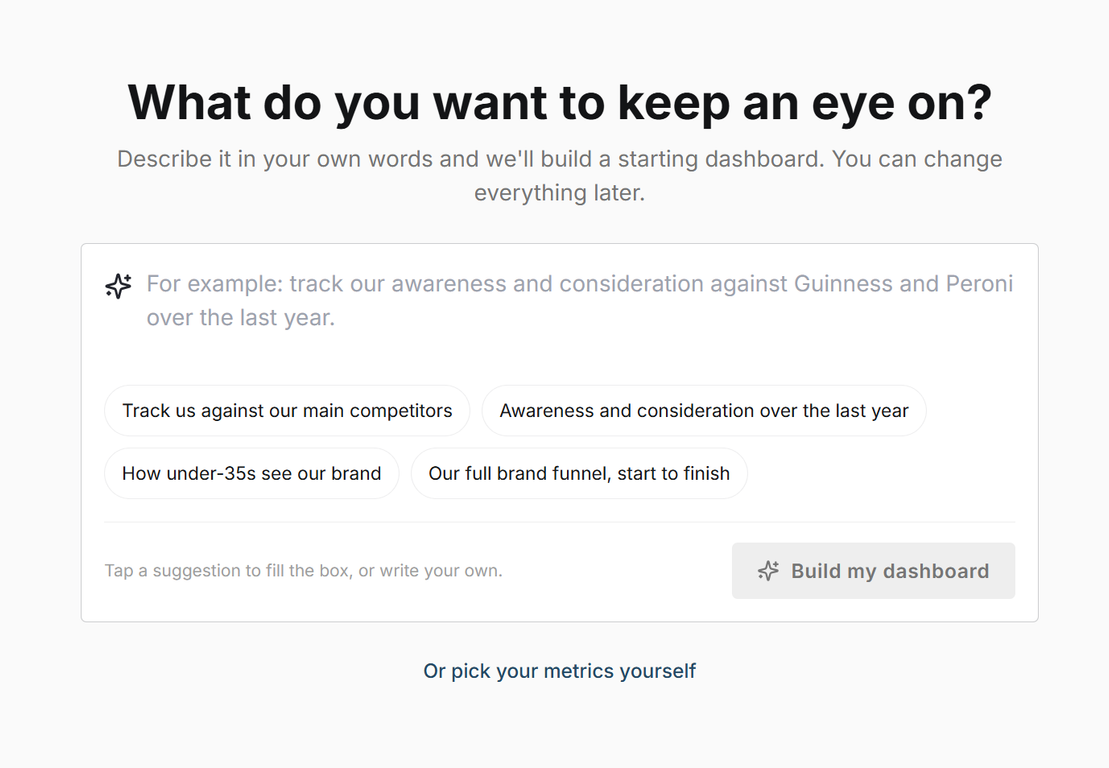
AI that speeds the work up, without taking the pen.
I designed AI's role against the four user types, rather than bolting on one generic assistant. Most of it is small, quiet help, not a chatbot in the corner.
On every dashboard, generated from the data.
Nobody starts at a blank field. Every name changes in a click.
The "what this tells you" behind each metric, written for you.
Two rules held throughout. Every AI output carries the reasoning behind it, never a number on its own. And the person always keeps the pen. Nowhere was that harder to honour than the headline.
A headline you can trust when the news is bad
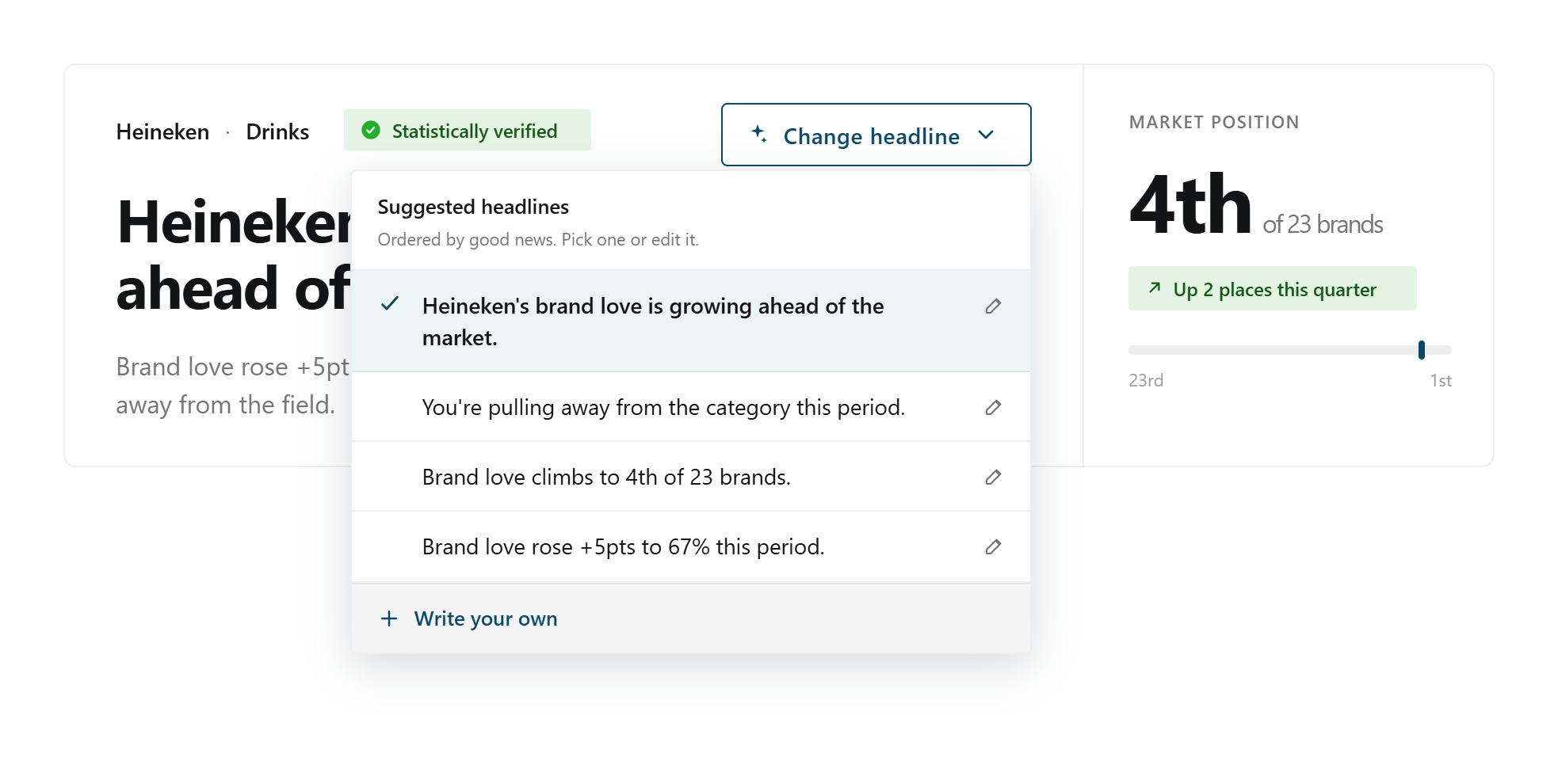
Letting AI write the headline raised a question I could not dodge. Good news is easy. But what happens when a client's brand is sliding? Flatter them and the dashboard becomes a liar. Tell them cold bad news every morning and they stop opening it. Either way the product loses.
The answer was not a cleverer algorithm. It was a principle. Truth, framed well. Brand metrics are always relative to the market, and that is the way out. "Falling, but slower than the category" is both reassuring and completely true.
So the system follows a ladder. It leads with the highest statement that is true, significant, and as positive as the facts honestly allow.
- Growing, ahead of the market. Say it plainly.
- Falling, but less than the market. Reframe to relative strength.
- Stable while the market drops. "Holding position while the market slips."
- Genuinely bad, and significant. Tell the truth plainly. Rare, and the rung that matters most.
That last rung is the whole point. A system willing to deliver bad news when it counts is one you believe the rest of the time.
Running the room, and growing a designer.
This was a genuine 50/50 with a midweight designer. Her research is strong and started the discovery. I ran a stakeholder design day to turn a room that knew the product's complexity intimately into one aligned on simplifying it.
Her growth edge was a common one. She wanted users to make the design decisions for her, worried about getting the complexity wrong. Part of my job was showing her that the designer makes the call from the research, then validates it. Watching her move into confident, testable decisions was one of the better parts of the project.
The hardest room was internal. Our stakeholders knew every corner of BrandVue's depth, and they were anxious that simplifying it would strip out the value. We tested the new approach with them and walked them through the thinking. Once they saw that clarifying the route to the data did not mean losing the data, the resistance turned into support.
The next test is external, and it is the one I am most keen to run. Going in, my assumption is that the headline and the story panel will land with every user type. The open question is the deep builder. How much clarification it still needs before it is genuinely usable for the less technical users, not just tolerated by them. That is what external validation is there to answer.
What I took from it
Complexity is where value hides
The data was never the problem. The route to it was, and that is a design problem, not a data one.
If a product assumes knowledge, it has to teach it
Expecting users to arrive fluent is a decision, usually an accidental one, and it quietly locks most of them out.
Design patterns are leverage
The same builder that made the product learnable cut client onboarding from months to minutes. One pattern, two problems.
A component library is for speed, not identity
We spent hundreds of hours bending Material UI to our brand. Used sparingly, it shines. Fighting it for brand fidelity cost more than it saved.