AI product design · Savanta
Turning two weeks of survey coding into two minutes
Savanta's first AI workflow. Built for researchers stuck with long waits, slow manual coding, and a real fear that AI was there to replace them.
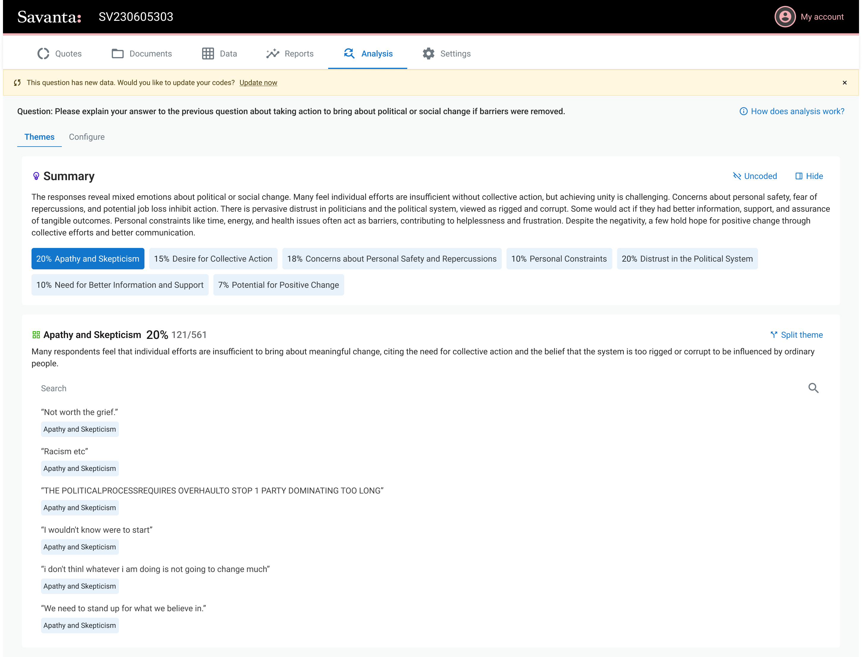
Overview
A two week job, done in two minutes. The researcher shapes every theme, and the people who feared the AI ended up asking what else it could do.
AllVue is Savanta's insights platform. Coding open text answers meant researchers waited on slow, manual hand coding. It was the first AI workflow in the suite.
Every project meant a two week wait, three with translations. Researchers sat on insight they couldn't touch, and feared the AI was there to replace them.
A two week wait, gone. Researchers shape every theme themselves, and the fear turned into "what else can it do?"
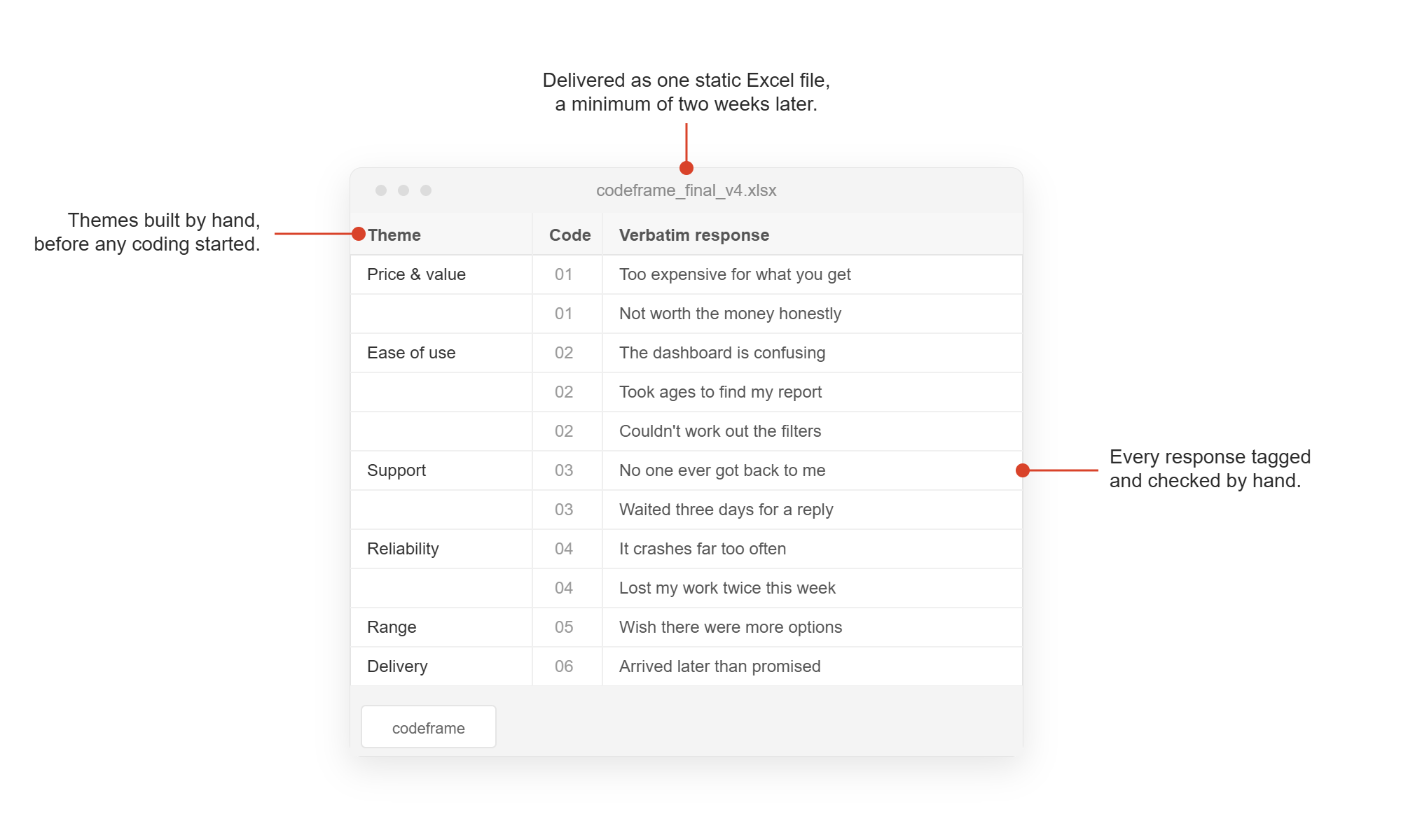
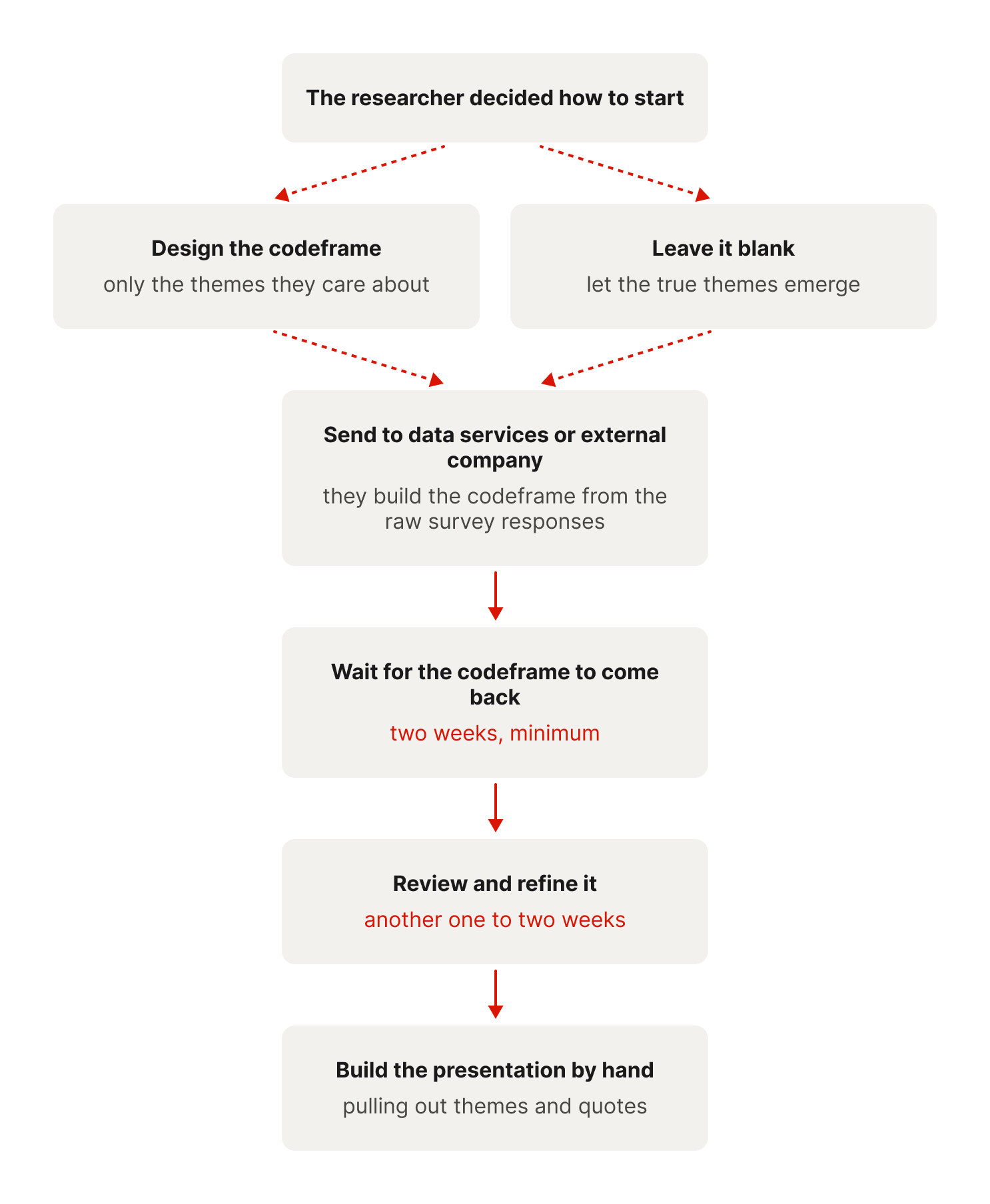
Every project meant a two week wait, minimum.
For a researcher, insight was always two weeks away.
- Open text responses went out to be hand coded. Two weeks minimum, three or more with translations.
- What came back was an Excel codeframe, checked line by line before any insight could start.
- Past 2,000 respondents, jobs were turned away. Roughly £1.2m of work the year before.
"If I'm on a project that needs translations, that's three weeks just to get the data back. If you don't laugh you'll cry."
Research user, discovery interview
The brief said replace the tool. The real job was trust.
This was the first workflow in our suite to use AI, and the worry was blunt. AI was here to replace them.
That fear had a real cost. People wouldn't talk openly about how they worked, in case it trained the model that replaced them.
The brief looked like a like for like swap, rebuild the coding tool with AI. The real challenge was two things it never named. Earn the trust of the people who feared it, and keep them in control of the coding instead of handing it over.
Everyone was chasing better coding. The gap was control.
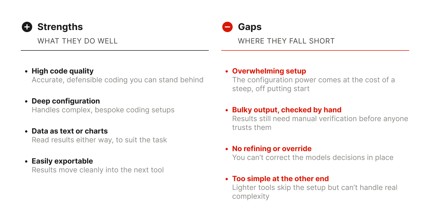
I looked at the traditional tools and the newer AI ones. They landed on two clear sides.
- Heavy configuration for coding quality. Traditional platforms mixed manual and AI to get precise coding, with mixed results and a punishing setup.
- AI that wants full control. Simple workflows that theme and export for you, but they only really worked on simple data, with no way to override.
Three needs, and they clashed
I interviewed five users, digging into the why to separate the needs from the wants, and to understand the whole workflow rather than just the tool.
No use to anyone competing on turnaround if it isn't fast.
People won't touch AI they can't check.
Room to shape the data into their own story.
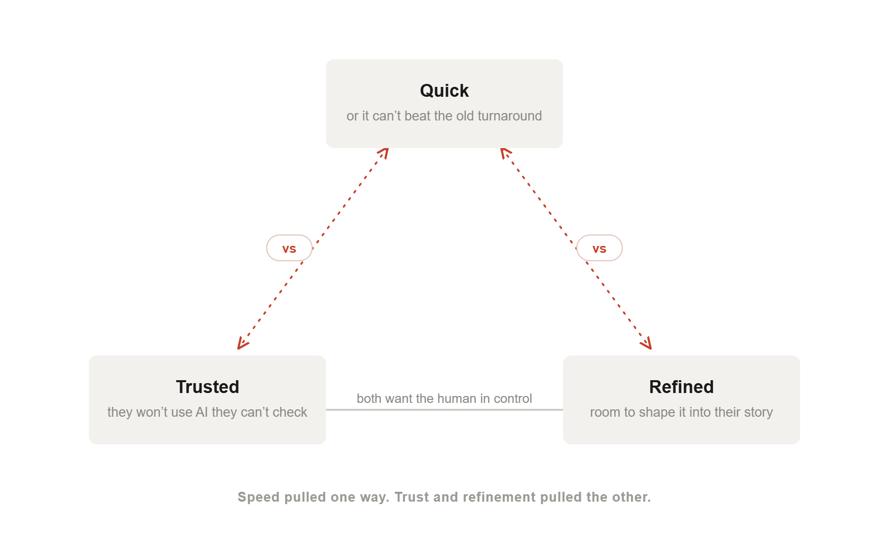
I was chasing the wrong thing
Every user named the same top priority. Does the coding quality match the tool we use today. It was the only benchmark they'd ever had, so the AI engineer and I chased it. It was only when I stepped back that I saw it wasn't where we won.
Coding open ends isn't a science, it's a craft, personal to each researcher. They didn't need the old process rebuilt. They needed to reach the same quality of finished insight their own way, from a good enough start.
The trade off. I took a lower quality starting point, and never sold it as more, in return for getting people to the same finished result far faster.
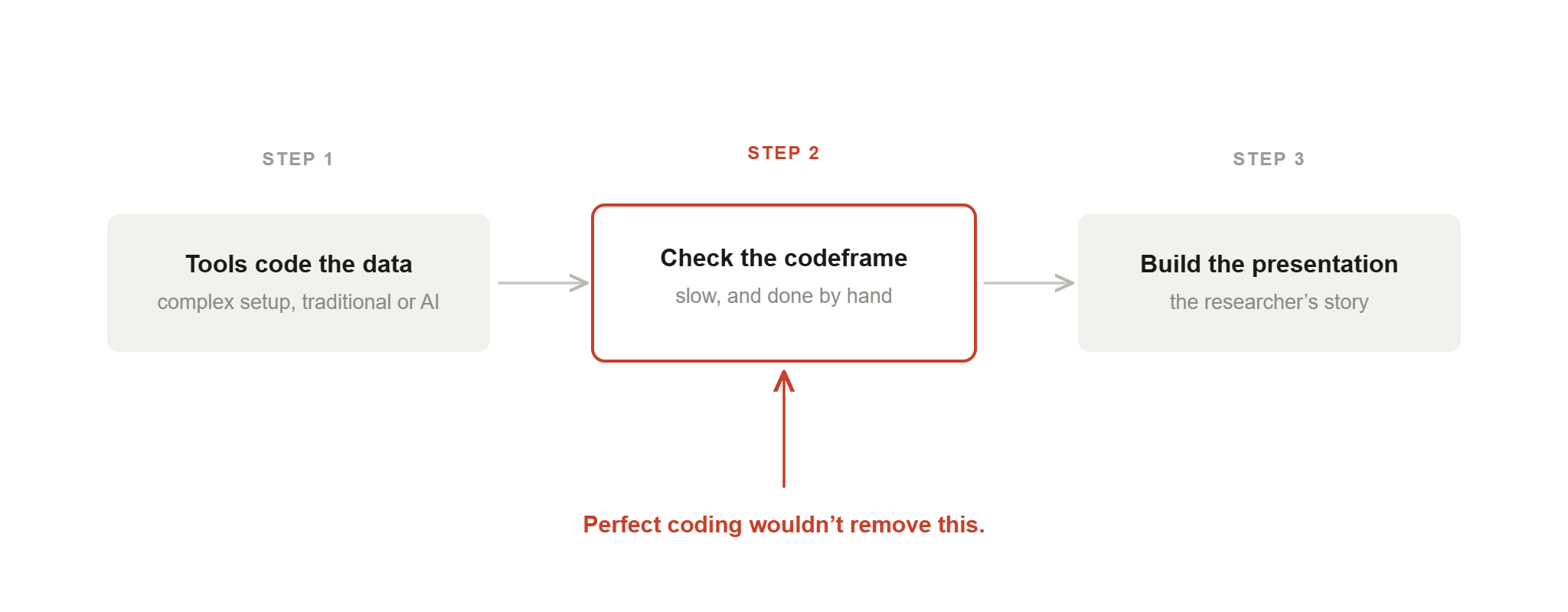
They told me quality was everything. Turns out what they wanted was room to add their own craft.
Show the work, then hand back control.
Experts working to client deadlines won't trust an answer they can't check. So anywhere the AI did something visible, I built it around one simple rule.
You can always see what the AI did, in plain words.
The responses behind any theme are one click away.
Rename, merge, split or recode by hand. You sign it off.
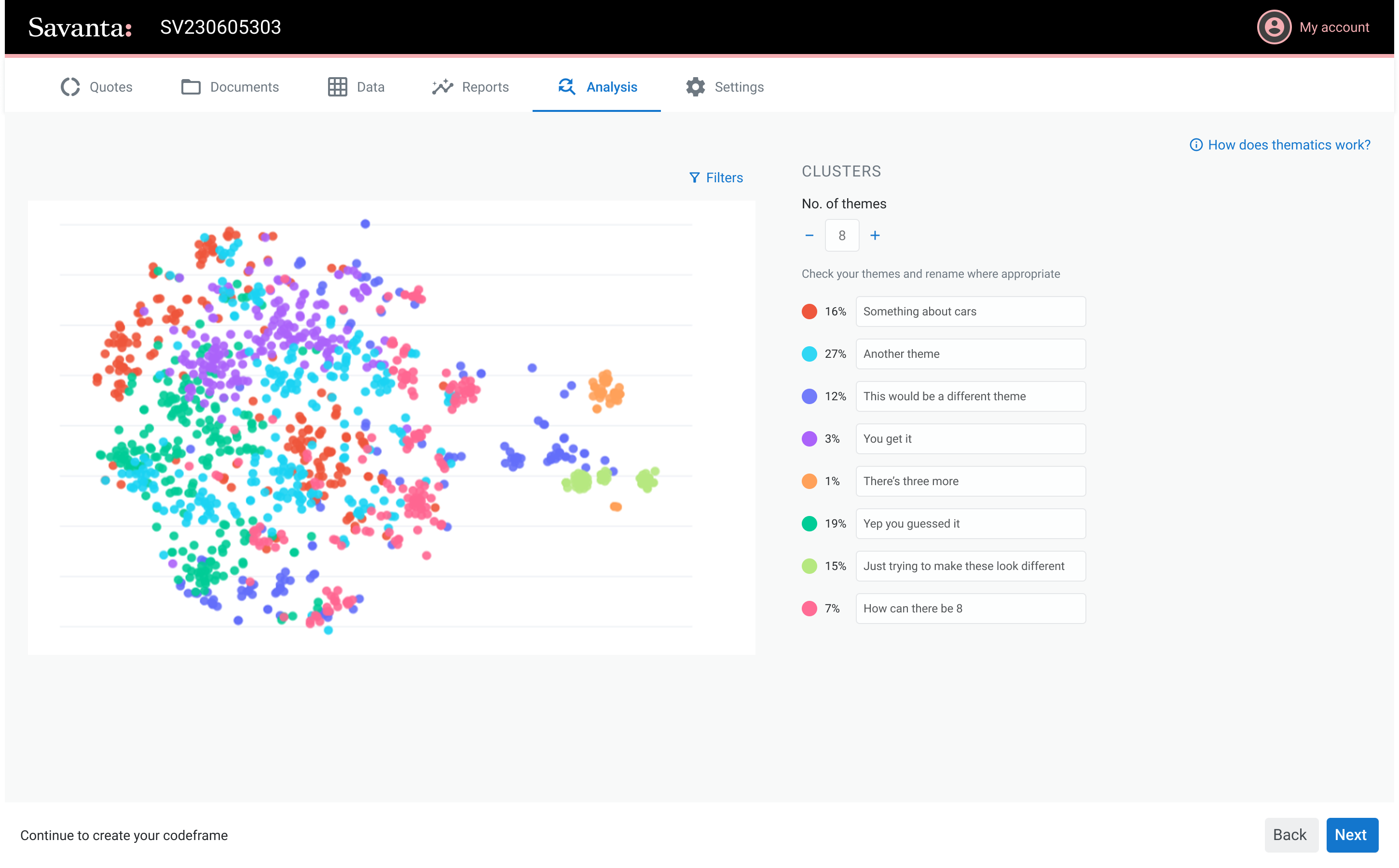
The most accurate visual was the least useful one.
I mocked theming as a cluster plot. Every response a dot, grouped by how the AI saw them. Technically it was the closest thing to how the model actually works. This is a classic case of listening versus watching. The feedback was warm, "it's cool", but watching people use it, the picture told them nothing they could act on.
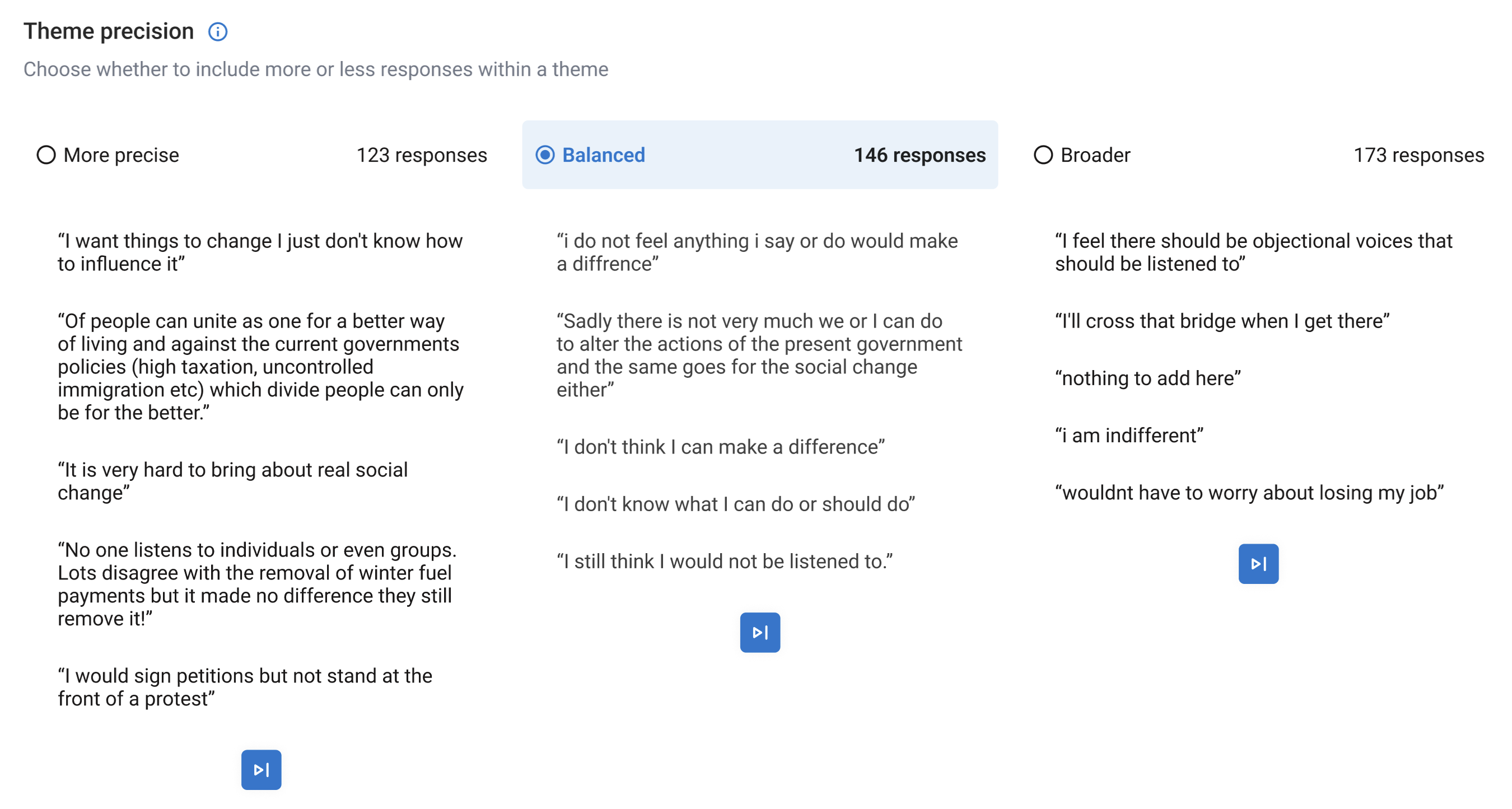
I stopped deciding where each theme ended.
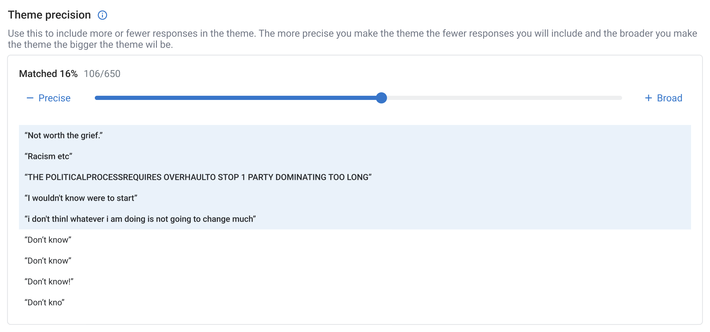
My first version gave three presets, more precise, balanced and broader. They worked, but they were my structure forced onto their data. Then I noticed the AI scored every response by how well it fit a theme. So I swapped the presets for a slider. The advantage of using AI to code was the ability to sort by relevance to theme. Giving the researcher precise and quick control of each theme.
I led with the answer, not the impressive visual.
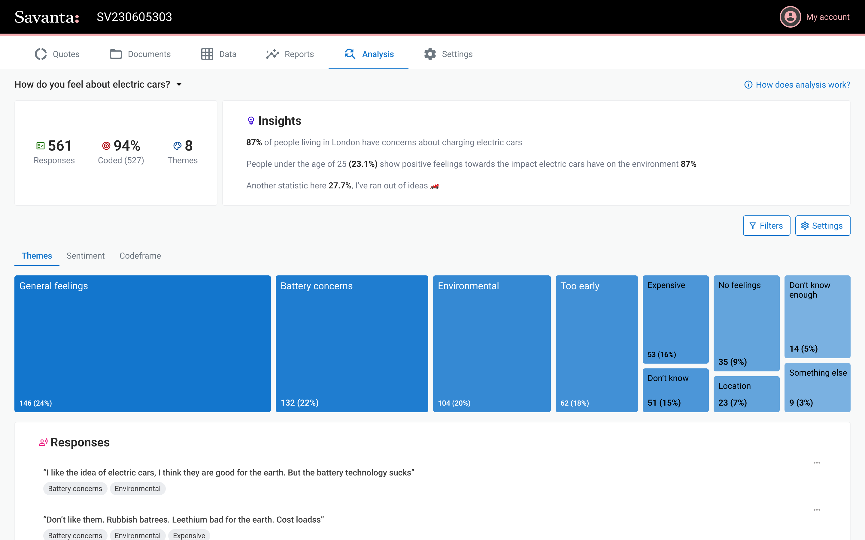
From there the researcher owns it. Rename a theme, merge two that overlap, split one doing too much, recode a single response by hand. But an early results view showed themes as big colour blocks sized by share. It looked impressive and buried the responses. The final view leads with a plain summary, drops the themes to a simple list, and keeps the responses one click away.
From "will it replace me?" to "what else can it do?"
The real validation was what people stopped saying. Quality had been the whole conversation, would it match the tool they used today. On release that question just went away. Nobody was benchmarking it against data services anymore. They took the like for like as read and moved straight on to what more it could do.
"OMG this makes it so much quicker. Can it do sentiment analysis? Can I export direct quotes? This is genuinely going to be a game changer."
Research user, on release
It shipped to a closed BETA, so we could get it into people's hands sooner, with a feedback loop with users to decide what came next. Sentiment analysis, more chart types, coding for ongoing tracker surveys.
One nice surprise. Because it's quick and cheap to run now, we can analyse open ends on any survey, not just the ones scoped for it up front. Every survey finished with 'anything else to add' question which used to get ignored. Now it turns into insight for free.
What I took away
It's not just users who don't know what they want
Everyone on the project team, told me quality mattered most. Users behaviour told me control did.
With AI, restraint is the design
Deciding what to hold back is most of the job. The truest picture of the tech was the worst thing to show a user.
AI can step change, not just improve
Earlier fixes clawed back a bit of time. This turned two weeks into two minutes.
What I'd do differently
Set expectations with stakeholders earlier. I defended the "fast start, not perfection" line later than I should have.